Data entry
High-level form guidelines
Many Cosmopolitan apps are transactional in nature; booking a room is one of the most common success metrics for the brand. For better or worse, web forms are the primary way to pass data back and forth. Orchid components employ a handful of smart principles to make data entry as quick and painless as possible for the end user.
When creating a form for a user to interact with, remember these 2 steps:
- Forms should be as short as possible, but no shorter.
- Illuminate a path to completion.
Form design
By default, Orchid form components utilize top-aligned labels, as they tend to reduce completion time by creating a vertical line of sight to the end of the form.

Input selection
The humble input has a number of type variations, and HTML5 only adds to that robustness. HTML5Doctor describes each of these new types in detail.
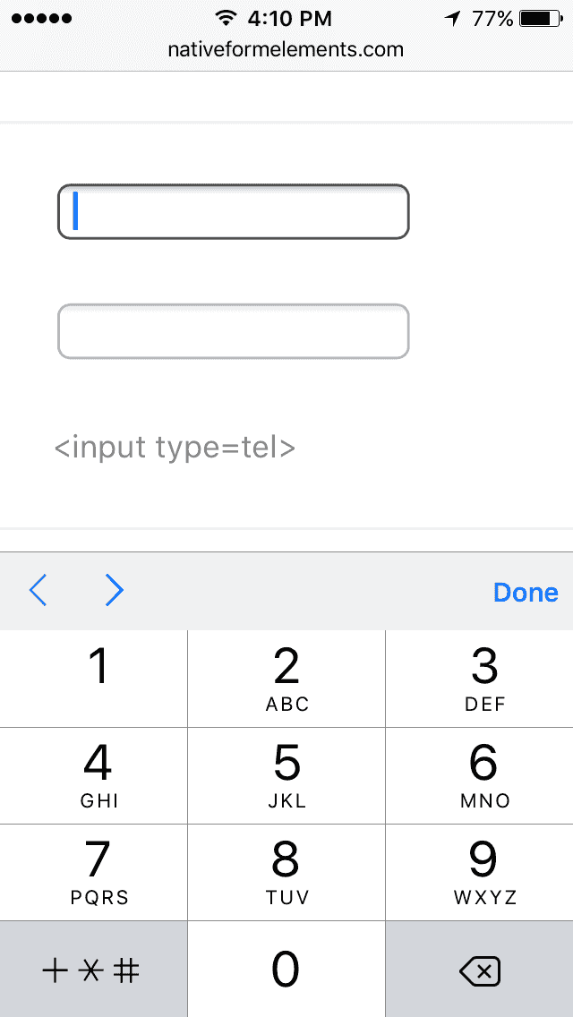
On devices that support the HTML5 tel type, the keyboard switches straight to a number pad on focus, making form completion that much easier.
Required and optional fields
A good place to start is to clearly designate what fields are required and optional. This needs to be more than just a visual indicator. The requirement designation is content that’s core to the data itself, so it’s not enough to have the denotation only exist in CSS; the designation needs to be in the markup.
When users interact with forms, they expect to fill out fields. It’s safe to say that a user may assume all fields are required, so Orchid apps should only designate optional fields in text directly after the field label:

From a markup standpoint, any field that’s required should use the required HTML attribute:
<input type="text" required />
Selects, checkboxes, radios… oh my!
HTML generally provides a number of ways to make selection from a group within a form. As Orchid components, you have at your disposal:
Which one should you choose? Here’s a primer for you:
- If the user should be able to select two or more of the options, use Checkboxes.
- If the user should be able to select only one of many options…
- Use a Toggle to display 2-3 options.
- Use Radio Buttons to display 4-7 options.
- Use a Select to display 8 or more options. (But remember: dropdowns should be the UI of last resort.)
Managing long forms
Even though you’re trying to keep your forms as short as possible, there will be some times that you need to ask the user for a lot of information. Consider one or more of these ways to break your form into chunks:
Progressive disclosure
Progressive disclosure is a useful technique for handling long forms. The basic idea is that you display the minimum amount of content for the user to make an informed decision and allow them the opportunity to request more info if interested. This can happen purely on the client side to show or hide and element, or you can use Ajax to load up-to-date content from the server where needed.
An alert interaction pattern is a good example of progressive disclosure in action.
Further research
- Web Form Design, by Luke Wroblewski and Rosenfeld Media
- Marking Required vs. Optional form fields
- Drop-Down Usability: When You Should (and Shouldn’t) Use Them